The challenge
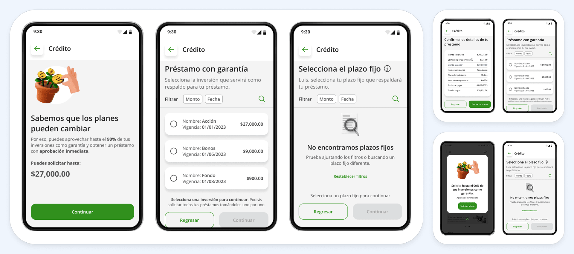
At kubo.financiero we found that some users behind on payments could still see active additional credit offers inside the self-service flow, because of a lag in how the system updated. This created confusion and added operational load for the support and collections teams. The challenge was to redesign the flow to prevent these cases, making sure offers only appeared to users who were eligible in real time, and clearly explaining why when no offer was available.
Process
Research
I spotted the problem through advisor reports and support monitoring. I mapped the steps of the self-service additional credit process, focusing on how the status of the previous loan was validated.
Design
I defined a validation point at the start of the flow to check whether the user was up to date on their loan. I designed a screen that clearly tells them their status has changed and that no offer is available for now. I iterated on the message to make it clearer and more empathetic, and proposed an illustration to reinforce it.
Development / Automation
I worked with engineering to define the triggers and technical conditions needed to run the validation in real time.
Role and tools
Role
- Problem detection
- Flow mapping
- Screen design
- Copywriting
- Engineering alignment
Tools
- Figma
- Intercom
- Google Sheets
- Miro
- Google Sites
Outcomes
- Fewer cases of confusion and complaints caused by inconsistent offers
- An effective validation in place before the offers screen is shown
- Stronger perception of the app as trustworthy, by communicating credit status changes clearly
- Design, engineering, collections and support aligned around one coherent flow
What I learned
Clear communication at moments of status change is what keeps frustration down. Business conditions need to be validated not only when an offer is displayed, but also on entry to the flow. Screens that offer no action — such as "no offer available" — need a positive, empathetic and well-designed message so they do not push people away.